4.07.2009

Common Side-Effects: The Influences of Context on Architectural Design

I have recently been focusing on the effects of cultural, social, and economic forces on our built environment. With this post I would like to rely more on the role that site-specific forces play on the design process of buildings. For each project, the architect is faced with inherent conditions in which he or she must respond to in their design. A few examples of these design considerations can include environmental orientation, adjacent property program, and building regulations from various agencies. These factors are unique to each project and can vary significantly based on the city in which the design occurs. Within the United States, there are a number of major metropolitan areas that have unique zoning codes, or lack thereof, that are indirectly responsible for the make-up of the urban fabric seen in our cities. In this post I will respond to the presentation of two projects from major cities in America, Los Angeles and New York. The first article, “Formosa 1140 by Lorcan O’Herlihy Architects”, was written by Megan Wilton of Dezeen Design Magazine and shows a new project by Lorcan O’Herlihy. The second building that will be examined is publicized in a story in Architectural Record, titled, “Tall Buildings Push Limits by Steeping Up, Not Back,” and focuses on another residential project at 23 East 22nd Street, designed by Rem Koolhaas’ OMA. In both of these jobs, the architects are challenging common building typologies indigenous to their regions in order to find innovative ways of enhancing the end product. My comments on the aforementioned posts can be found on their respective websites, but have also been copied below for convenience.

Formosa 1140 by Lorcan O’Herlihy Architects
Comment

I find this building to be particularly interesting in comparison to the vast pool of typical courtyard and “C” shaped housing blocks throughout Los Angeles. Not only are these buildings plentiful, but they usually yield underused public/private spaces creating a condition of wasted and often unsafe space. LOHA’s new type signifies a new housing typology, which if implemented and encouraged through zoning in specific areas of Los Angeles, could provide better, more usable, open space. The combination of these newly created spaces with adjacent properties would result in a holistic approach to urban planning where multiple buildings share a larger communal amenity that is more effective, programmatically, based on the many buildings that would activate the public space. Basically, the otherwise miniscule, gated-off “public” spaces of the typical L.A. apartment would become parts to a larger network of more usable space. LOHA’s proposition, however, is a bit idealistic without any form of city policies because without an enthusiastic developer, the economical impact of leaving half the site as landscape renders the gesture unrealistic.

Another positive issue that I would like to raise is the notion of defensible space, where safety of a region can be provided through the environments design. The traditional form of housing resulted in narrow residual spaces on all four sides of the building and a larger, unused open space in the middle. What concerns me is the narrow spaces between buildings that is created by zoning setbacks. The new typology proposed by LOHA, at the very least, eliminates one of these slender alleys and couples it with adjacent properties to create larger more visually defensible spaces. Ultimately, the move creates a safer, more usable park that benefits the building as well as the neighboring community. Although not an entirely new concept, the thought of ganging clusters of properties to create better shared spaces is an intriguing idea that, when applied in L.A., could yield a much more efficient use of land. In short, allocating smaller under-used spaces into larger activated parks should be a priority for our struggling city.


Tall Buildings Push Limits by Stepping Up, Not Back
Comment

After Rem’s studies of “the possibilities for skyscrapers following the landmark 1916 Zoning Law”, a building that challenges the legislation was inevitable and this example proves to be very engaging. Until now, high-rise and mid-rise buildings were typically extrusions with little to no interaction with the urban context. Aside from façade treatments or pulling the street into the lobby, bold urban gestures are not often seen in pinched sites with strict constraints such as this. Some might argue that the result is a posh move that is expected and made possible only because of “starchitect” Rem Koolhaas’ status, but once again, with further investigation, the moves actually generate some pretty sensitive contextual moves while also providing some major positives for the tenants and the community. The default ziggurat form provided by the zoning code provided outdoor terraces as you went up the building, but it also reduced the overall usable floor space as the building goes vertical. I enjoy the overall aesthetic of the shifting of floor plates in the building and can also appreciate the way it creates the same roof gardens as the ziggurat but also preserves the interior space. Granted these benefits of the design, I would imagine that the principle selling point for Rem to justify the large and hugely expensive cantilever is in order to preserve park views of the developers neighboring residential tower. While this is a sensitive move to this building, I wonder if it is impeding on another neighboring buildings view that a straight, vertically extruded building would not have. Even though the building’s main formal move is not an entirely new one, as seen in examples such as Herzog and de Meuron’s 56 Leonard Street project, OMA’s version seems to be the most contextual to date and is also the first to cantilever significantly over an adjacent property. I wonder whether the various contextual moves actually benefit the community or if they simply generate an awesomely sexy building that also provides the tenants with interesting spaces and amenities.
3.31.2009

Innovative Marketing: Changing the Landscape of Urban Cities through Interactive Advertising

As mentioned in my previous posts, the global economic downturn has provided many opportunities for designed interventions in the urban cityscape. In “The New Multi-Purpose Room,” I comment on two relevant projects inspired by financial crises. Both of which are responses to a current condition and, if not actual solutions, the generators for possible answers. With hundreds of projects emerging in light of recent hard times, I strongly believe that innovative design and thinking will help ease the effects of the recession. An example of this can be seen in the evolution of traditional marketing to the emerging forms of advertising and how they have begun to merge with building and infrastructure to benefit both corporations as well as the public.  Technology is playing a pivotal role in the integration of architecture and branding which has culminated in the digitalization of many urban spaces. The trajectory of merging these two entities remains mainly positive, however, there are foreseeable scenarios in which these advancements can become exploitative.

For decades, the common means of marketing a company ranged from print ads, to radio broadcasting, to television commercials. Based on the budget of a corporation and the target demographic, the appropriate venue was chosen. Since technology is constantly evolving, the ways of advertising have found the need to parallel these changes. With the invention of products such as Tivo and XM Radio, comes a way for users to bypass the aforementioned marketing techniques. As a direct consequence of these convenient services, came the demand for highly designed and innovative advertising mediums. Recently, Kentucky Fried Chicken made a truly interesting breakthrough in that the people behind-the-scenes managed to gain positive publicity for the fast-food chain, as well as issue a much-needed public service. The franchise arranged to fill pot-holes in Louisville’s many roads and in exchange, would be allowed to stamp the words “refreshed by KFC” on the new pavement. The design of such a strategy yields high visibility for the restaurant chain, much like traditional advertising would, however the byproduct is updated infrastructure in a city that would otherwise be unable to repair. Although KFC’s idea is extremely effective, it is only original in its application. Other examples of providing public services as a means of private gain can be seen in many other forms. Charmin has also been using these tactics for the past couple of years in Times Square. The toilet tissue giant inhabits prime real estate in order to offer public toilet facilities plastered with the company’s logo. Charmin has seen dramatic sales increases with the publication and visitor attendance of the bathroom experience, but at the same time, Times Square visitors are supplied with a clean and hassle-free restroom.

The above innovative marketing strategies are examples taken from large corporations. This same thought has been applied on a smaller scale throughout our nation’s cities. With the current economic status, shopping centers and malls have hit their highest vacancy levels in seven years. As a result, a dramatic increase in empty retail space has effectively caught the attention of advertisers and property owners alike. Bus stops, billboards, and taxicabs have all been canvases for advertisements in the last decade or longer and vacant storefronts are now the current subject of opportunistic ad-space. The forthcoming hardships have forced people to adapt to the current situation and professionals are using their resources more efficiently. Not only are these window ads becoming increasingly popular, they often times supply an equivalent income as compared to renting to an actual tenant. Inwindow Outdoor, based out of Manhattan, reports that a single ad “might charge advertisers anything from $18,000 USD to $80,000 USD a month.” This trend in storefront advertising has led to another interesting idea in the field. Landlords are now shifting their property’s programmatic uses in order to cater to a broader demographic. A theater in Virginia recently leased its failing venue to the local community college. It now supports classrooms, two lecture halls and offices. These examples are lessons in versatility and resourcefulness that will allow our cities to survive.

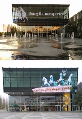
Although beneficial, the abovementioned approaches employed by KFC, Charmin and building owners are more market strategies and development based tactics rather than architectural schemes. Even though these ideas are loosely related, there has been a definite merging of architecture and marketing. Integrating media into buildings has been a recent trend that is quickly emerging as a common practice. Firms devoted to these methods, such as AG4, have even been created with the aim of “expanding a [companies] identity into the spatial dimension.” Progress in fields such as LCD displays coupled with the economic downturn has made the pairing of façades and advertisements an inevitable development that ultimately created an increased interest in communication through architecture. The stagnant print ads used to plaster the sides of buildings will slowly become obsolete as technology is pushed. The popularity of personal electronic devices, such as the iPod and Blackberry, has lessened people’s awareness and natural senses. Simply put, people are less responsive to their environments and immersed in their individual worlds. This notion of wanderers blindly navigating a city has rendered the many billboards and print ads that adorn our urban fabric obsolete. In an attempt to more efficiently grab the attention of the people, billboards and other advertisements have gone digital. Following this trend, architects have incorporated high-tech LCD screens into the facades of their buildings in an effort to further engage the masses. An example of this fascinating technology can be seen in the photo above, which demonstrates a transparent screen that displays illuminated moving advertisements. An even newer development that has yet to enter the public realm of our cityscapes is Augmented Reality. Companies such as GE and Mini have both produced marketing schemes using this new technology which essentially uses recognition software and cameras to display real objects or people interacting with virtual entities. This complex process can be seen on GE’s SmartGrid website.

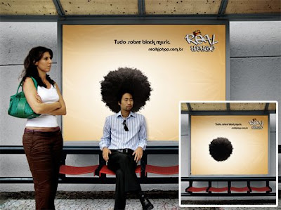
The introduction of new technology, such as Augmented Reality, into the built environment is inevitable. Much like the evolution of the billboard, and the use of digital building facades, it is only a matter of time before advertisements become increasingly more interactive. The contact between the ad and the public can be as latent as the print pictured at left or as invasive as a digital image that captures a passerby and alters it in whichever way sells. At what point will society draw the line on advertising in the public realm and how will companies filter who is engaged? The layering of architecture, advertising, and technology has the potential to be very productive, but at the same time extremely invasive. The unknown factor is how low marketing executives are willing to go.

3.10.2009

India: A Case Study For Living

In light of the recent global economic crisis, I find it necessary for the world to think innovatively on the way in which we live and build. As the scope of the world drastically changes, the cities we inhabit must follow. No stranger to this transformation is the developing country of India. Weaved into many of the major cities is a network of impoverished neighborhoods. These regions have often been labeled as “slums,” for lack of a better term. Their relevance to urban studies is apparent in that one-sixth of the world’s population occupies some form of slum and the billion people this includes is expected to double in the next few decades. These areas are the collective product of the societies who create them, making them the purest form of an organic urban condition. As a precedent, they are particularly interesting because the issues that surround them are so complex. These controversies are often seen from a cynical outside point of view, and rarely looked at as a possible catalyst which could produce applications of improvement for the modern society. In this post I consider an article by Matias Echanove and Rahul Srivastava, who are affiliated with the Partners for Urban Knowledge Action and Research. Titled, “Taking the ‘Slum’ out of Dharavi,” the argument clearly observes the positive aspects of the low-income societies depicted in the recent film Slumdog Millionaire. In addition, I further examine a post by Katia Savchuk, entitled, “Housing Post-Disasters,” which offers an insight into the effectiveness of the housing provided as a result of natural disasters. The aforementioned articles and their respective comments can be found on the links above, but have also been placed directly below.


Taking the ‘Slum’ out of Dharavi
Comment

While Slumdog Millionaire has provided a vast array of discussion on the internet, I am pleased to see an argument of such substance and open-mindedness. I have recently been lucky enough to travel to India, and although I was unable to visit Mumbai, I feel that cities such as Delhi and Varanasi were of significant comparison in regards to your thoughts. The cinematic collage of Mumbai, which ultimately culminates as the image of Dharavi in the film, struck an eerily familiar tone from my days in India (seen at right). People who have never experienced these pocket neighborhoods would find it easy to draw negative conclusions about them; however, I agree whole-heartedly that there is a definite lesson to be learned from the “sheer resourcefulness of its inhabitants” and the organic nature of these areas. What I enjoyed most about my visits, also shared by that “certain brand of photo-reporters and slum tourists,” is the urban palimpsest quality that has been laid over time. The locals drying clothes and selling food amongst the grazing cows all superimposed on centuries of architecture that has been broken, patched, rewired and adapted over time. This serendipitous charm and the sensory overload that you receive with every turn is what makes India worth seeing. But perhaps this is the attitude of the fortunate visitor and not the viewpoint of the end-user of these areas. I cannot help but wonder whether these people are truly benefitting from the landfills that they inhabit. Albeit, they provide a level of economic value in the way that they recycle, but there must certainly be a better, cleaner, more sustainable method to the madness that occurs in Dharavi. I believe the people here make do with what they are given and are incredibly resilient, which results in the photogenic nature of these regions, but is that reason enough to say that they are happy with their current situations? I also agree that spreading development of Mumbai over the area would be a negative, but do you think there could be some way the area could be developed to enhance the cleanliness, safety, and economic production of Dharavi without displacing the local residents?


Housing Post-Disasters
Comment

With the current increasing frequency in natural disasters, now is a more appropriate time than ever to discuss the issues of post-disaster housing. As a designer, I naturally feel that good design should always be the point of departure for a better solution. In the lower-income regions of India, their success comes with their ability to adapt their environment. Evidence of this overlap in infrastructure, technology, building, and lifestyle is apparent in the layering seen on any given alley in India (see picture at left). Perhaps this is the reason that the “cookie-cutter” homes were left vacant soon after they were provided. Do you think that a more suitable solution could have been a kit-of-parts where locals are supplied the resources to design a more personal dwelling? I feel that this could conceivably be a more sustainable approach in that the end user is more likely to use a home programmed to their uses. The makeup of the kit could simply be designed based on the region that it is being supplied to and custom tailored towards the indigenous population. For example, in the fishing village of Chandrabhaga, materials needed to store and process fish could be provided. Another consideration I have noticed in your post is the appearance of modern ideas in the relief structures. The home in Mundasahi that “can be expanded as resources become available” echoes the ideas instilled in the modern prototype by Le Corbusier, the Museum of Unlimited Growth. The use of the rooftops in these homes also mirrors Corb’s five points of architecture, where the ground plane taken by the buildings footprint is restored in the form of a roof garden. Could this use of modern architectural ideas or reverse precedent study be incorporated into the houses in order to improve their usability?

3.03.2009

The Art of War: World Conflict Informs Urban Intervention

It is the goal of this Blog to put forth regional influences which shape architecture in a constantly evolving world. Since the landscape in which we dwell is always changing, we must be open to the departure of existing systems and preconceived notions of building. This abandonment of common thought should also be applied to our understanding of hierarchy and public space within the urban cityscape. In my previous post, titled “The New Multi-Purpose Room”, I referenced a topic that is deserving of some further discussion. Within the last few decades there have been many political conflicts that have occurred across the globe, but until recently, they have remained distant events in regards to the architecture community. It is this unconventional realm of architectural influence that I raise the issue of conflict urbanism. In this post I will present two ensuing projects that were designed as a response to regional conflicts and hopefully create some dialogue within the discussion.

Conflict urbanism can be described as architectural and urban responses as a result of opposing regions of tension. An example of this can be seen in the Berlin Wall. The project mentioned in my previous post is “Metastructure” by Lebbeus Woods. In this exploration, Woods examines the conflict involving the Serbian and Croatian invasion of Bosnia and Herzegovina. The nature of these attacks was governed by the NATO enforced no-fly zone and thereby forced to be grounded. As a response, Woods proposed to erect an artillery-impenetrable wall that would have to be engaged by foot (rendered at left). The extreme thickness and labyrinth-like spatial quality of the Metastructure would prolong invasions and eventually separate large battalions into smaller groups. These groups of soldiers would ideally become famished and be forced to post stations and form eventual colonies within the confines of the buffer zone. Within these settlements, local economies could emerge as local Bosnian farmers penetrate the spatial wall in order to trade food and water for other goods and services.

Although this response to the Bosnian war is a bit romanticized, it continues to be a worthwhile discussion for the creation of boundaries. Even though this exact scheme probably would not work in the real world, the ideas that are infuses into the design promotes a new use for walls as spatial mechanisms rather than vertical boundaries. In a world full of property lines and retaining walls, where else might this idea be incorporated?

Another area of conflict that has influenced a recent project takes place among the Israelis and the Palestinians. This sensitive situation, if for nothing else, has yielded a particularly interesting architectural intervention in Viktor Ramos’, “The Continuous Enclave: Strategies in Bypass Urbanism”. As a result of the Oslo Accords, modern day Israel is subdivided into communities that form an intertwining network of Palestinian and Israeli settlements. The physical division of these neighborhoods creates a disconnection between each group. The continuous enclave creates a break in the vertical boundaries and bridges the gap between each cluster of Israelis or Palestinians (seen at right). These mega-structures create opportunities for housing, transportation, and even agricultural complexes. While providing a means of traveling safely through Israel, the proposal also provides a means for expansion for each group as the current system of sharing the landscape is simply isolated nodes making up a larger network of cities.

The fantasy of the continuous enclave remains to be just that, fantasy. Realistically, I would like to see the project deal directly with the hostile situation in Israel. Instead, it offers an over-the-top solution that, rather than confronts the issues, ignores them. As seen in the title of the article, the continuous enclave simply “bypasses” the conflict. Inversely, as a theoretical thought, it is basically a literal interpretation of bridging over vertical boundaries. The simple move of elevating the ground plane into a synthetic layer of habitable space has been seen in many theories such as Constant’s New Babylon as well as Yona Friedman’s Ville Spatiale. Unlike this project however, Constant and Friedman’s ideas were projected around half a century ago. The two structures proposed in these theories also happened to be open-trussed, airy solutions that appeared much lighter and sensitive to the existing context. This Ramos’ enclave appears to be a bulkier design that would cast mammoth shadows that would eclipse the land that it passes over, possibly creating further conflict.

Perhaps there is no architectural intervention that could possibly solve a war between nations. To say that good design of an environment can solve issues of this magnitude and complexity is a bit of a stretch, however, these projects can also be described as an idealistic approach to a greater issue. These solutions, at the very least, serve as vehicles to deliver awareness abroad and the theory provided can give a point of departure for the end product that actually produces change.


2.23.2009

The New Multi-Purpose Room: Hardships Yield Inspired Solutions

I have recently written about the effects of development in Shanghai, China and argued for and against the various emerging forms of building that are occurring in the region. Local phenomena that spawn from urban developments can be seen across the globe in every city and in varying scales. These occurrences are informed by factors such as, local government policies, cultural norms, the economy, and social forces. Therefore, In order to form judgment on any one locale, it is not only essential to look at what is occurring in other parts of the world, but it is also important to distinguish the cause and effects of the solutions that are implemented. In this post I will be examining an article found in BLDGBLOG by, Geoff Manaugh, entitled “Mathscape”. Manaugh, aside from being the creator of BLDGBLOG, is also the senior editor of Dwell Magazine. In addition to the aforementioned post, I will also be commenting on the post, “Posh to Be Poor: Housing”, that focuses on the future effects of the economic downturn in America. This article, written by Marc Couillais, can be found on Where or by clicking on the corresponding link to either of the above articles (found below).

Mathscape
Comment

First and foremost, I would like to say what an interesting project this is and, as well, the ideas and discussions which it evokes. I think it is clear that Project H has an obvious goal in mind with the math playground and after seeing this, I believe that it is successful. Their manifesto states that they are here to “encourage the reorientation of the design industry towards a more socially-impactful and humanitarian entity”, and therefore the design of their projects must inherently serve dual-roles. The primary or realistic role (in this case the playground and place to study), and secondly, the role in which you call the “spatial pedagogy”. Your questions of a society in which our environments are geared towards education are interesting when applied to schools and even universities, but unfortunately, I would argue that when put in a situation such as your everyday commute to work they would prove as wasted design efforts. Nevertheless, the fact that we are discussing this is reason enough for Project H to inject such a project. In addition, to further the discussion, I recently read an article by acclaimed architect Lebbeus Woods, titled “Metastructure”. In this, he proposes a fantasy-driven idea towards a defense mechanism for the conflict in Bosnia. This is relevant in that the idea was basically a wall that would serve dual purposes. The fortification would be built as a spatial labyrinth that would separate and slow groups of soldiers to either their death or their eventual inhabitance of the wall. To further the fantasy, Woods goes on to say that the metastructure could eventually become a city in itself as the Bosnian farmers would move closer to supply food and water to the soldiers as a means of economy. Although both of these ideas have dramatically different trajectories, I see them as both being relevant in that no matter how effective they are in their primary roles, their secondary purposes are worth studying in order to achieve a greater design initiative. In this case, one in which conventional architectural elements, such as the wall or classroom, is pushed beyond the realm of typical uses and thus an entirely new entity is created.

Posh to Be Poor: Housing
Comment

It would seem that the issues regarding housing and the economic downturn in the United States will never become exhausted; however, it is refreshing to finally see an interesting take on the subject. You have thankfully laid out some intriguing ideas with respect to the current state of the nation and the way in which a designer looks at such issues. We are experiencing a unique era in which innovation is necessary in order to progress past the hardships. Being as bold as Congresswoman Marcy Kaptur suggests in stating that families should “stay put” in their foreclosed homes is a realistic approach to the situation in that she is simply advocating the use of existing resources to house displaced families. Why expend additional energy in relocating families and erecting temporary housing when perfectly good homes are left vacant and unsold? While this approach seems to be the sensible solution, it is the various designers’ ideas that interest me. The Homeless Chateaux, for example, is a fascinating idea that goes beyond the obvious use as a minimalist room. To me, the merit in the idea of this “chateaux” is less about how it works and more in how it is used contextually. As James Westwater proposes it to be a room within a room, perhaps there could be a series of these modular Homeless Chateauxs that could than start to inform a greater community. And further, could this begin to suggest a new system of modular living units that could be inserted into a realistic context of perhaps the aging warehouse loft? These units would have to be improved dramatically, but as an idea I find them to be quite interesting and perhaps even hip to the times. Your thought on the gradual migration to the aesthetics of the poor is proof that Westwater’s Chateaux is an idea worth developing. The investigation into the adaptive re-use of everyday items, such as the street sign and pallet used in this project is sure to yield a worthwhile product.

2.17.2009

Shanghai: Hybrid Urbanisms Create Profitability, Tension, and Unknown Trajectories

The rapid pace of development in China has resulted in a phenomenon that will begin to shape the urban fabric of its major metropolitan areas. Shanghai is no stranger to this rampant change. Like many international cities that are rich with history, Shanghai has become an urban microcosm that includes a series of unique neighborhoods that have been shaped over time and are stitched together forming a singular urban context. The charming nature and history of the city has since been depleted in certain areas as developers have opted to eradicate the traditional housing typologies in favor of larger high-density housing blocks. While these new developments provide an enriched style of living with modern luxuries, they simultaneously erase the character of Shanghai that has been layered throughout time, and ultimately, the erection of such mega-blocks creates a stale and stagnant context to a once culturally rich skyline.

The aforementioned method of development is an extreme approach that has been used quite often in the residential sectors of the city. A slightly more sensitive design ideology is demonstrated in a commercial project called Xintiandi. As seen in the photo at right (taken on my recent trip to Shanghai), Xintiandi is a two block long strip of modern shopping, entertainment, and restaurants. This particular project can be viewed as a hybrid between a master-planned development and historic preservation. The area was completely demolished and re-built to accommodate the intended programming of the site. Although it is a ground-up construction project, the design called to retained some of the charm of the historical buildings through the use of salvaged bricks and ornamentation. So, from a historic preservation point of view, the site was constructed with a sensitive material palette, however; the buildings are essentially modern structures that house an entirely new use and intention. The original design philosophy, according to a report from the Urban Land Institute, aimed to create a scene where “people walking the lanes…step on the same gray flagstones and see the same red and black bricks, lacquered doors, and stone gate doorframes as those who walked there generations before.”  While the intentions are worth mentioning, I would argue that this experience is a marketing ploy that is not realized and falls short of the sensitive approach of which the developer speaks. The actual authenticity of the landscape is comparable to any of the major Las Vegas hotels which strive to emulate famous cities such as Venice or Paris. Economically, the project has far exceeded expectations and also provides a playground for Shanghai’s aristocrats and tourists. Unfortunately, the impact on the local residents who lack the resources to afford the twelve dollar lychee martinis and eight dollar pastries extends far beyond the two-block site. Xintiandi has become such a success that it has triggered the emergence of high-density luxury condos and offices to emerge on every site within a twenty-block radius. This sudden increase in modern development has not only inflated the regional cost of living out of the native resident’s reach, but it has also dramatically changed the urban fabric of a significant portion of Shanghai. For better or worse, Xintiandi has become a major node of interest within the landscape of the city and an economic engine for real estate development.

Perhaps the most current and interesting site of recent work in Shanghai can be found in a region known as Taikang Lu. This area is an example of adaptive re-use at its purest form. In the mid-1990’s the block consisted of dilapidated housing and industrial buildings. The government was faced with the decision of what to do with the aging area and in 1998 they chose to preserve a large pencil factory and convert it into an artist studio. Since then, creative professionals of all trades have taken up spaces along Taikang Lu and inserted studios, cafes, boutiques and galleries into the ground floor of a majority of the block. The district has taken a slow, organic and less master-planned approach to development that in the case of this sensitive area seems more appropriate. Since these modern storefronts are inserted into the existing historical fabric (as seen at left), the resultant space is a labyrinth of complex programmatic relationships and adjacencies. Along any given alley the scene can involve local residents playing cards in their sleepwear, next to an Australian businessman sipping lattes, across from the local fish market. This juxtaposition of old and new, and rich and poor, has created a complex layering of activity that has enriched the experience of Taikang Lu. While other master-planned developments, like the invasive housing blocks, erase centuries of urban layering, Taikang Lu injects modern innovation into an existing condition that ultimately preserves the historical context of the city.

Although Taikang Lu has become a successful precedent for urban rejuvenation and adaptive re-use, it also raises its own issues of economy and displacement. Currently, a stalemate exists between developers and residents of the aging slum because merchants could not justify paying the relocation costs that the locals are demanding to live outside in the inflated markets of Shanghai. At the same time, many locals feel that the incoming businesses and tourists that they attract are invading their neighborhoods and are causing tension within the public realm.  According to the Shanghaiist, some residents have even posted banners in protest of the gentrification of Taikang Lu.  In contrast to this, the locals who have been relocated have received a substantial increase in quality of life by being moved to a more luxurious area. From here, the region and the city of Shanghai alike, must explore new trajectories in which the quality of life can improve for everyone. How will the local residents who choose to stay in Taikang Lu begin to adapt their lives in order to profit from the presence of this new social group? Are modern ground-up operations, like Xintiandi, or more contextually sensitive developments like Taikang Lu more appropriate for Shanghai? Both developments have opposing positive and negative implications, but ultimately share the same goal of preserving culture while encouraging future innovation and invention.

1.20.2009

A New Player Emerges: The Amorphous World of Architecture Meets A Fresh Voice

I am pleased to post the first entry of a blog that will strive to educate readers on an issue that shapes the world in which they inhabit. This blog aims to provide insight into the amorphous world of architecture and the urban fabric in which it shapes. Architecture, according to the general public, is often mistaken as just buildings. After extensive studies, I have found that all things in the built environment, whether it be a building or a park bench, begins to form a context in which all elements feed off one another. It is this notion that leads me to further reach to the un-built influences on architecture. These influences include, but are not limited to; social, political, cultural and economic forces. With that said, this blog will explore local phenomenons that shape the built environment of regions across the globe.

I begin my blog by introducing a set of resources in order to extend the scope of knowledge outside this particular discussion. At left, you will find a linkroll of relevant websites and blogs from a carefully selected group. The group was created by first searching general terms of relevance to Architecture and Urban Design in search engines, such as Google, and blog engines, such as Technorati. From there, locating research projects from reputable front runners in the industry and using them as a platform to link to other reputable sources proved to be a reliable way of finding new sites within the field. Once found, these online resources were then filtered using both the IMSA Criteria and The Webby Awards Criteria which are each used to determine the quality of a particular site. The Webby Awards Criteria uses 6 categories to judge a site; content, structure and navigation, visual design, functionality, interactivity, and overall experience. The IMSA Criteria uses a set of questions that challenge the credibility of a site’s contributor(s), sources, community, and language. The photo (above left) shows how two particular sites, Death by Architecture and World Changing, use visual design in two very different yet similarly effective ways. World Changing takes a classic and professional design where as the other uses an edgier and more experimental approach which I find to be quite appropriate for the design field. The selected sites have also been chosen to include a variety of sources including group blogs (such as BLDGBLOG), organizational sites (like Storefront for Art and Architecture) and commercial sites.

Before I depart, I would like to encourage the visitation of the various sites presented in the linkroll as they can be a valuable resource once Sight.on.Site begins to provoke thought and curiosities into its readers.

 
Creative Commons License
This work is licensed under a Creative Commons Attribution-Noncommercial-No Derivative Works 3.0 United States License.